Curry Packaging

Packaging Design
May 2023

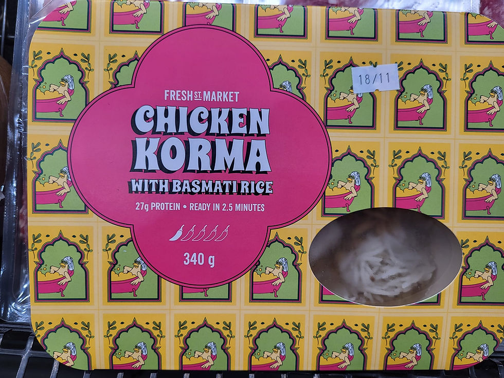
After the success of the illustrated soup identity, Fresh Street Market invited us to expand the visual system into their in-house ready-made curry line. Building on the playful personality established in the soup program, I evolved the same illustration style into a more pattern-driven approach—creating a cohesive extension of the brand.
Each curry flavour was represented through custom patterns built entirely from my own original ingredient and character illustrations, ensuring the designs remained respectful, playful, and uniquely tied to Fresh Street Market’s brand voice. The goal was to capture the spirit and warmth of each dish while maintaining a fun, approachable visual identity that felt authentic to the established style.
To support ease of navigation, I developed a colour-gradient system that communicated spice level intrinsically, helping shoppers instantly understand the heat profile of each meal. This palette created a clear flavour hierarchy and unified the collection across multiple SKUs.
Deliverables included packaging layouts, custom illustrated patterns, and container labels, all designed to seamlessly extend the existing soup identity into a more sophisticated, layered ready-made meal system. The final result celebrated creativity and flavour without leaning on traditional cultural motifs—focusing instead on playful originality and thoughtful, research-backed design.
Flavours
 |  |  |
|---|---|---|
 |  |  |
 |  |
Research & Concepting


Mockups


In Situ